In the gaming industry, where users expect seamless experiences across various devices, responsive design has become a critical component of game development. A responsive game interface ensures that users enjoy a consistent and engaging experience whether they are playing on a PC, console, mobile device, or even in a virtual reality (VR) setting. This article explores best practices and tools for designing responsive game interfaces, helping you create a versatile UI that adapts effortlessly to different screen sizes and input methods.
What Is Responsive Design in Gaming?
Responsive design refers to the practice of creating interfaces that adapt dynamically to different screen sizes, resolutions, and orientations. In the gaming world, this includes designing menus, HUDs (Heads-Up Displays), and interactive elements that look and function perfectly across devices like:
- PCs and consoles with high-resolution displays.
- Mobile devices with varying screen sizes and touch-based input.
- VR/AR platforms, where spatial interactions and gestures are key.
By ensuring your game UI is responsive, you not only enhance usability but also broaden your audience by making your game accessible on more devices.
Key Challenges of Responsive Game Design
Responsive game design poses unique challenges compared to traditional app or web design:
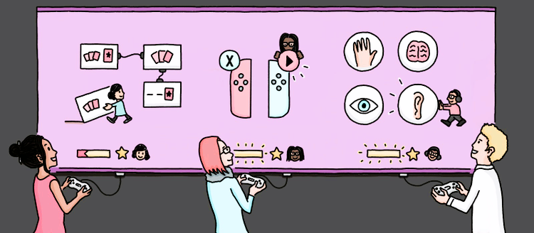
- Diverse Input Methods: Controllers, keyboards, touchscreens, and VR gestures all require tailored UI elements.
- Performance Optimization: Ensuring the interface runs smoothly on both high-end and low-spec devices can be difficult.
- Consistency Across Platforms: Maintaining a cohesive visual and functional experience across devices is critical for player immersion.
Best Practices for Responsive Game Interfaces
1. Start with Scalable Vector Assets
Design UI components using scalable vector graphics (SVG) or similar formats. This ensures elements retain quality when resized for different screens. Tools like Adobe Illustrator (integrated with Armature) allow you to create versatile assets ready for export.
2. Use Fluid Layouts
Adopt percentage-based or relative units for layout dimensions instead of fixed pixels. For instance:
- Buttons and icons should scale proportionally based on the device’s resolution.
- Menus should adjust spacing dynamically to fit the screen. For action-packed game interfaces, read our essential design tips for FPS games.
3. Design for Multiple Aspect Ratios
Different devices often have varying aspect ratios (e.g., 16:9 for consoles, 4:3 for tablets). Create and test layouts for common ratios to ensure compatibility.
4. Prioritize Key UI Elements
On smaller screens, such as mobile devices, focus on the most essential UI components:
- Use collapsible menus or swipe gestures to save space.
- Employ overlays and modals sparingly to avoid clutter.
5. Implement Adaptive Controls
Design controls that change based on the input method. For example:
- Use on-screen buttons for touch devices.
- Display controller-specific prompts for console players.
6. Test Across Devices Early and Often
Regularly test your UI during development on multiple devices to identify and fix scaling, alignment, or performance issues. Tools like Unity and Unreal Engine offer simulators to preview interfaces on different screen sizes.
Tools and Frameworks for Responsive Game UI Design

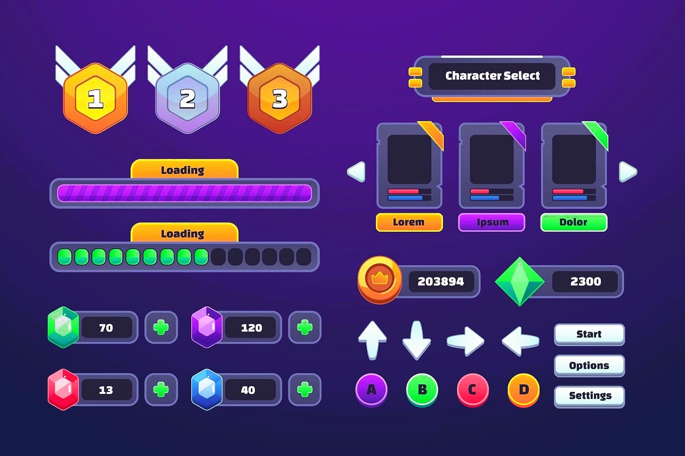
1. Armature for Adobe Illustrator
Armature simplifies prototyping for responsive game interfaces by offering a library of ready-made elements, including buttons, menus, and HUD components. It allows designers to create scalable layouts with ease.
2. Unity UI Toolkit
Unity’s built-in UI system provides flexibility for responsive design. Use anchors, canvases, and layout components to create interfaces that adapt to various resolutions and screen orientations.
3. Unreal Engine UMG (Unreal Motion Graphics)
Unreal Engine’s UMG framework enables developers to design responsive UIs with dynamic scaling and alignment.
4. Third-Party Plugins
Plugins like Scaleform (for advanced HUDs) and NGUI (Next-Gen UI) offer features tailored for responsive game design.
Real-World Examples of Responsive Game Design
- Fortnite: The game adapts its HUD and menus seamlessly for PCs, consoles, and mobile devices. Its responsive design ensures consistent gameplay experiences.
- Among Us: With minimalistic yet effective UI design, Among Us adjusts its controls and layouts for mobile, PC, and Nintendo Switch players.
- Minecraft: Whether in desktop or pocket edition, Minecraft’s UI scales perfectly while maintaining usability.
You can explore more about game interface design standards on resources like Fandom.
The Future of Responsive Game UI Design
With the rise of cloud gaming platforms like GeForce Now and Xbox Cloud Gaming, creating interfaces that perform across a wide range of devices is becoming increasingly important. Additionally, advances in AI and machine learning may allow UIs to adapt automatically to user preferences and play styles, further enhancing player experiences.
Responsive design is no longer optional in the gaming industry—it’s a necessity. By adopting best practices, leveraging powerful tools like Armature, and continuously testing your designs, you can create game interfaces that deliver exceptional experiences across all devices.