
Game interface design plays a crucial role in shaping the player’s experience. A well-designed user interface (UI) helps players navigate the game effortlessly, while a poorly designed one can lead to confusion, frustration, and a loss of immersion. As game developers, it’s vital to avoid common mistakes when designing game interfaces to ensure a seamless, engaging experience for players.
In this article, we’ll discuss five common mistakes to avoid when designing game interfaces, and how to ensure your UI contributes positively to the overall game experience. Whether you’re designing a simple mobile game or a complex virtual reality (VR) game, these principles apply across all platforms and genres.
1. Overcomplicating the Interface
Mistake: One of the most frequent mistakes game designers make is adding too many elements to the UI. It’s tempting to include every idea, feature, and control that comes to mind, but this can overwhelm the player. A cluttered interface with too many options, icons, buttons, and menus can make the game feel complicated and difficult to navigate.
Solution: Simplicity is key. A clean, minimalistic design that prioritizes essential functions will enhance usability. Focus on the core gameplay and ensure that the UI elements support the player’s actions without distracting them from the experience. Remove unnecessary features and ensure that every UI element serves a clear purpose. It’s important to keep only what’s necessary and make sure each component is easily understandable.
Pro Tip: Use white space effectively. It helps break up the interface and creates a sense of balance, making it easier for players to navigate.
2. Poor Visual Hierarchy
Mistake: Another common mistake is failing to establish a clear visual hierarchy. Without clear hierarchy, players may struggle to determine what’s important in the interface. When everything is given equal weight, players are forced to spend more time looking for the right information or button.
Solution: Prioritize important information using size, color, and placement. For example, key buttons like the “Start” or “Pause” button should be prominent, while secondary actions like “Settings” or “Leaderboard” can be placed in less prominent areas. Use contrast and typography to guide the player’s attention to the most important elements. Larger buttons or text can indicate primary actions, while smaller items may represent secondary tasks.
Pro Tip: Use color contrast to draw attention. Bright colors can signal interactive elements, while more neutral tones can be used for background elements.
3. Ignoring Platform-Specific Design Guidelines
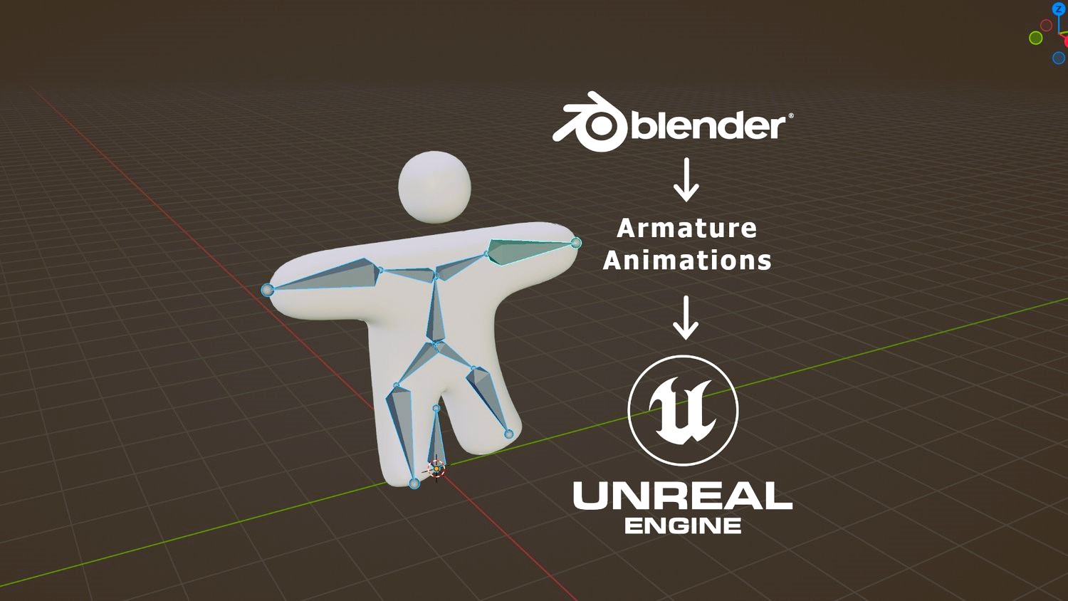
Mistake: Designing a game UI without taking into account platform-specific guidelines is a serious mistake. Whether the game is being designed for mobile, desktop, VR, or AR, each platform has unique design principles and standards that should be followed. Ignoring these guidelines can lead to a poor user experience and even make the interface feel out of place on a particular platform. Read our complete guide to game UI elements: what you need and how to use them.
Solution: Study and implement platform-specific design guidelines to ensure that your interface works well across devices. For instance, mobile games require larger touch targets and gestures, while desktop games benefit from mouse-driven menus and keyboard shortcuts. VR and AR require 3D spatial awareness, ensuring that UI elements are placed within the player’s line of sight without impeding gameplay.

Pro Tip: Ensure that your game’s interface feels native to the platform. This consistency will make it easier for players to interact with the game, making their experience more intuitive.
4. Lack of Feedback and Responsiveness
Mistake: A UI that does not provide adequate feedback can be frustrating for players. When players press a button or make a selection, they need to know that their action has been registered. If buttons are not responsive or fail to provide any visual or audible cues, players may become confused and unsure of what’s happening.
Solution: Always provide feedback for user interactions. This can include visual effects (such as highlighting buttons when hovered over or clicked), sound effects, or animations that indicate a change in the game state. For example, when a player selects a menu option, the button should visually change to show it was clicked, and a sound cue can confirm the action.
Pro Tip: Keep feedback simple but noticeable. Overly complicated animations or sounds can distract players. Aim for subtle, informative responses that maintain immersion.
5. Not Considering Accessibility
Mistake: Accessibility is often overlooked in game UI design, but it’s essential to make sure that all players, including those with disabilities, can enjoy your game. Whether it’s colorblind players, players with limited motor control, or those who need subtitle support, failing to consider accessibility can alienate a large portion of your audience.
Solution: Prioritize inclusivity in your UI design by implementing features that improve accessibility. Some simple steps include:
- Colorblind Modes: Ensure that color choices are distinguishable for players with color vision deficiencies.
- Keyboard and Mouse Remapping: Allow players to customize control schemes to accommodate different physical abilities.
- Subtitles and Audio Options: Include subtitles for dialogue and options to adjust sound effects, voice volume, and music.
- Contrast and Font Size Adjustments: Allow players to adjust the contrast and size of text, making it more readable for those with visual impairments.
Pro Tip: Test your game’s UI with players who have accessibility needs to ensure it meets their requirements.
Designing an effective game interface requires careful consideration and attention to detail. By avoiding these five common mistakes — overcomplicating the interface, poor visual hierarchy, ignoring platform-specific guidelines, lack of feedback, and neglecting accessibility — you can create a more intuitive, engaging experience for all players. Remember that the goal is not only to make the interface functional but also to enhance the overall gameplay experience.
Always test your designs and make iterative improvements to ensure the interface remains smooth, intuitive, and enjoyable.
For more on user interface standards, visit Wikipedia’s page on User Interface Design.